For our online journalism class we had to recreate a news website in wiki form. Myself and Alan Regan recreated the Daily Telegraph's website.

Visit our
Telegraph homepage An example of an
article page

Is it simply the cost benefit to media producers that is making them take notice of citizen journalists? It would be cynical to suggest such a thing, but it's a suggestion not without some truth.

Local papers in America are beginning to encourage participatory journalism. One such paper is
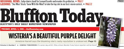
Bluffton Today which is one of the most successful local papers in the States. Their whole model is based on merging citizen journalist produced content alongside the content of staff writers. The daily publication was originally a freesheet but began charging 25c and 75c on Sundays.
The paper and website are being heralded as the new model for local papers, at least in America. This is just one example of where traditional journalism is merging with its citizen cousin.


There's one large repercussion of online journalism on journalists themselves that hasn't really been disucessed in any great detail. Online news is becoming more and more about the individual reporter. They must maintain blogs and twitter updates and keep the website up to date with the latest news (which now has the most miniscule of turn around times). The stress on a person of maintaing all this is incredible.
But the main point I was to make is that, in a tradtional newsroom, it was very easy for a journalist to take holiday time and he/she would be covered by another staffer. This si not the case anymore, the highly demanding twitter followers and readers of their blogs will not wait for a journalist to rest for a week or two like they themselves would expect to be able to do. This new breed of news consumers are demanding and if a journalist neglects them, even for their own well-being, they will migrate.
I think too much is being expected of journalists today. Convergence is all well and good, but the benefit of convergence is that a journalist can report in the most appropriate medium, not report in all media, all the time. There will come a stage where media employers are just expecting far too much of their employees. A worker of any kind can only take so much, that time has not yet come, but it will!

Denis
Filed Under:
Labels:
Interactivity,
online editions
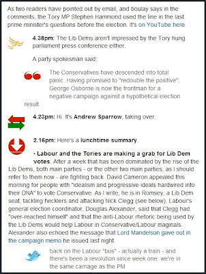
The Guardian and the Times are using Live Blogs to cover the events on the campaign trail. The blogs are nearly akin to micro blogging, though not as sparse in the length of updates as Twitter.
The blogs ensure that all the election news is neatly aggregated and easily accessible by visitors.
The
Guardian's blog is time stamped and has the party logos alongside the news when it relates to a specific party. There are also quote marks to the left if an indented quote to quickly identify them as such.

There is also an icon with arrows in an opposite direction to indicate that the author of the blog is changing. The blog links to other articles to allow readers read a more in depth article about the bigger stories. Web 2.0 is also included in the shape of tweets, which are clearly marked with the customary blue bird.

Denis
Filed Under:
Labels:
Interactivity,
online editions
The Irish Examiner is Ireland's third daily broadsheet newspaper. It status as a national paper is often questioned. The one platform that really levels all the papers is, or should be, the internet. The best way to attract visitors to the website is through having well written content which is neatly displayed and easily navigable.

A cursory look at the
site will show that there is a heavy showing for advertisements. The ads are not carefully placed either, they take prominence over everything else on the site.
One thing that the site does well, which may be a hangover from the print edition, is that the main story is the first thing that grabs your attention when the page loads.
After that the site lets itself down again and again. The headlines section for news only comes after two story teasers. The same format is followed for the world and sports news sections.
The worst thing about the website is that there is no real sense of cohesion to its layout.
The
article pages have no integration of web 2.0. There is a large picture at the top of the article which is followed by a large amount of text. The only thing that breaks the text up is a very crude Google ads advert. The only hyperlink actually asscoiated with the article is email and share buttons located at the top of the page.
All that aside, the worst thing about the site is that the content is only updated when the print edition goes to bed. The same stories are in the headlines for nearly 24 hours before they're changed.

 Visit our Telegraph homepage
  Visit our Telegraph homepage


